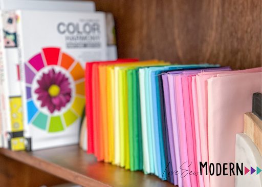
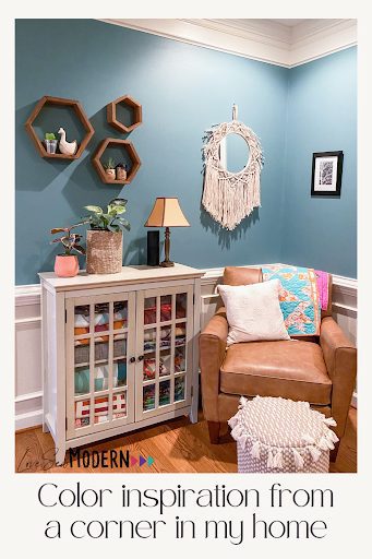
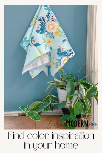
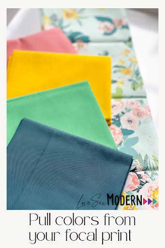
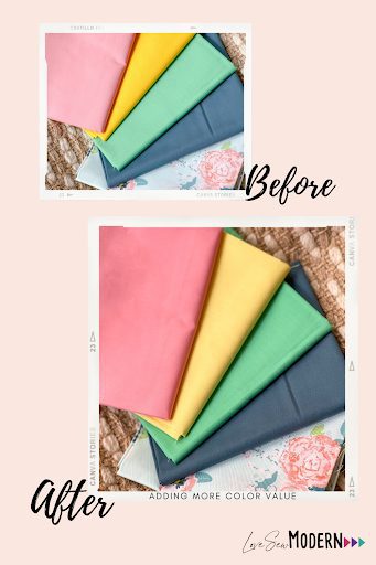
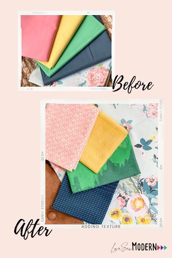
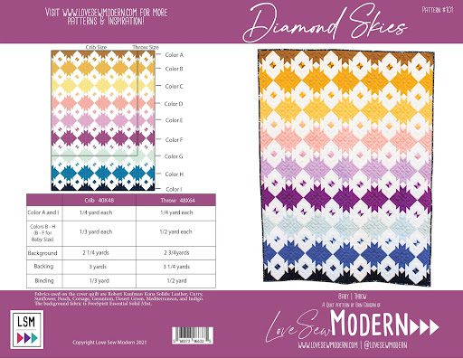
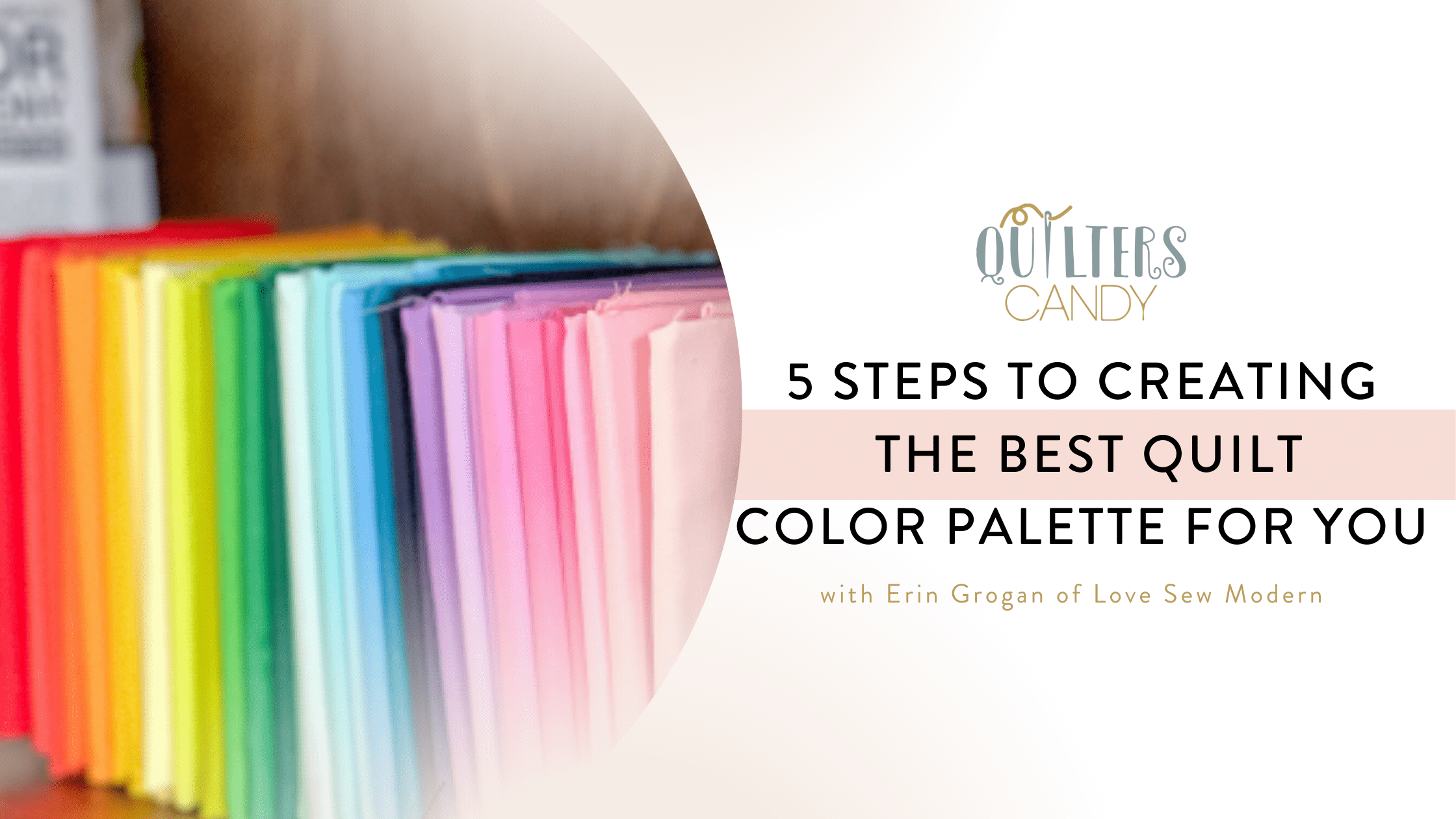
5 steps to Creating the Best Quilt Color Palette for You

April 26, 2022

Erin Grogan blog
Color wheel book with folded brightly colored fabrics lined up on a shelf

5 Steps to Creating the Best Quilt Color Palette for You

 Selecting the fabrics for your next quilt project can be overwhelming for both the beginner and the seasoned quilter. When you stop to think about the variety of color combinations to choose from you might feel more paralyzing by your choices than inspired.

Erin Grogan standing in front of a quilt

I’m Erin Grogan, the Founder and modern quilt pattern designer of Love Sew Modern, Marketing Director of Modish Quilter Magazine, and Content Director of Dandelion Fabric & Co. I’ve been playing and exploring with color in quilts for the past 6 years. During that time I’ve narrowed down my process for building fabric color palettes to make the process easy, stress free, and represent my style. Click here to get my Tossed Citrus Quilt Pattern and Palette Builder Worksheet for FREE. You can use these as you follow along in my process below and to reference for future projects.

Check Your Closet for Color

Cozy corner with comfy chair and blue wall for color inspiration

If I asked you what your favorite color was would you have an answer? More often than not people aren’t sure what their favorite color is, but our favorite color is the easiest starting place for building a color palette. Start by looking in your closet. Do you own more blue or green shirts? Is almost everything black? Then look around your house. What colors are on your walls or your throw pillows? Are you starting to see a recurring theme? You might be surprised how often you naturally gravitate to the same color, or always warm or cool tones.

Find Your Focal Print

Blue and pink floral fabric on blue wall with green house plant for color palette inspiration

Now that you understand what colors you’re drawn to look for a printed fabric in that color. Find something either in your stash or at your local fabric shop that sparks the feeling of joy for you. These prints are often full of colors and large scale designs, unless you’re more of a minimalist, then they might be more simple and small-scale. Now comes the math. I know. I just said a nasty word, math. I promise we will keep it simple.

Pulling Out Your Colors From Your Focal Print

Love Sew Modern Tossed Citrus Throw
Pull colors from your focal print showing solid colors of fabric and a floral fabric

We have to know how many colors we need for our quilt. Using my Tossed Citrus quilt pattern as an example, I know that I will need 4 colors and a background color. This means I will need to pull 4 colors from my Focal Print. Sometimes our Focal Print might not have enough colors to pull from to make our quilt. In these cases we can incorporate shades of the colors that are available from our print.   

TIP: You can grab a FREE copy of my Tossed Citrus PDF Quilt Pattern HERE.

The Importance of Contrast

Before and after photo of solids and floral showing contrast in color palette

Colors come in a range of values; light, medium, and dark. When pulling the fabrics for your quilt you’ll want to keep color value in mind because it can create depth and interest in your quilt. In this example my colors all read as a medium value. By switching out my dark yellow for a light yellow I can add more color value and interest to my quilt. 

TIP: Using your phone, take a picture of your fabrics together and convert the image to a black and white photo. Looking at the colors in black and white will be easier to see your range of color value.

Incorporating Texture in Your Quilt

solid colored fabrics, with one pink textures fabric along with a floral showing texture in your quilt color palette

Now that you have created your color palette, you can elevate your quilt by switching out some or all of your fabrics for fabrics that will add texture. This means adding fabrics with small prints, or incorporating wovens or linens. I’m often asked if it’s alright to mix different types of fabrics in your quilt and the answer is absolutely YES! Texture helps to create movement in a quilt design, which helps the viewer’s eye travel when looking at your quilt. When you add wovens you’re also adding a physical texture that can increase the cuddle factor in your quilt. 

TIP: You do want to be aware that different fabric types shrink at different rates in the wash. To avoid issues I’d recommend pre-washing your fabrics before cutting into them. 

Putting Your New Color Skills into Action

Browsing your local quilt shop and pulling bolts of fabric off the shelf can be overwhelming at first. Don’t be afraid to utilize the cohesiveness of a fabric collection. It’s not cheating to use a collection. They’re designed for that purpose. You can even bring the Palette Builder Worksheet with you to help keep to a plan and follow the steps. If you’re unable to go fabric shopping in person I’d recommend reading my blog post for shopping for fabric online. You can apply these Fabric Color Palette building skills to my tips for selecting fabric online even easier.

Now that you have the knowledge and confidence to build your own Fabric Color Palettes I invite you to try some of my favorite color exploring patterns; Circuit, Maven, Mirrored, Diamond Skies.

Mirrored Pattern front and back including measurements in with yellow and blues
Diamond Skies pattern cover
Cricuit pattern
Maven Pattern cover with blues, yellows and red colors

MORE BLOG POSTS LIKE THIS ONE


or SEARCH THESE

Popular categories

Craft to Career
Digital Downloads
Patterns
Podcast
Quilt Alongs
Quilt Questions
Tutorials
back to the top

Copyright 2024 Quilters Candy  |  Terms & Conditions