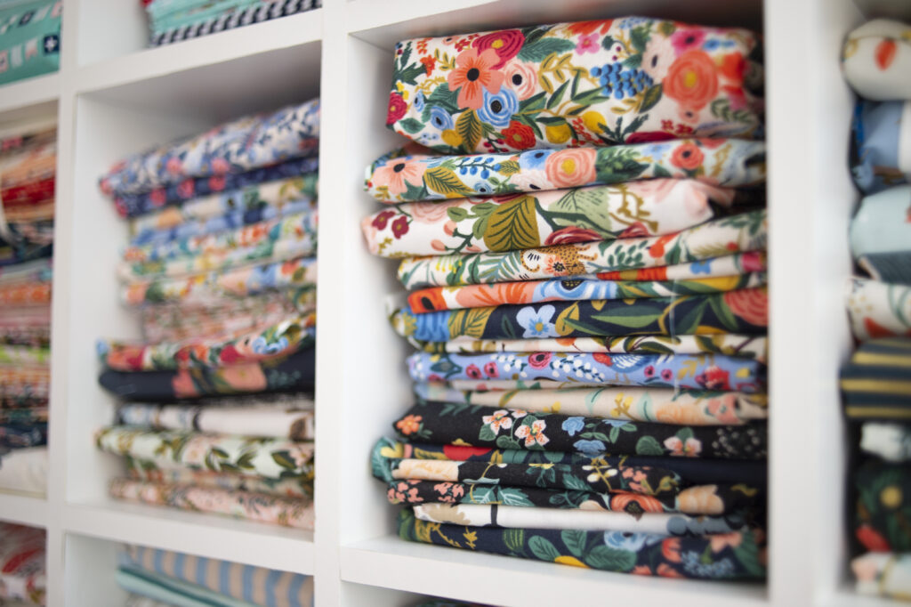
Choosing fabrics is one of the most exciting parts of quilting—but it can also feel overwhelming. With so many colors and prints available, how do you know what will actually look good together? The secret is color theory. By using the color wheel as your guide, you can confidently select fabrics that create harmony, contrast, or bold drama—whatever you want your quilt to say. Download my free Quilter’s Color Wheel Guide workbook to help you choose fabrics with confidence.
The color wheel is more than an art tool—it’s a quilter’s roadmap for fabric selection. It shows how colors relate to one another, making it easier to see which fabrics will work together and why. Whether you’re choosing solids, tone-on-tones, or busy prints, the color wheel can guide your choices.
SIX COLOR THEORY METHODS FOR QUILTERS
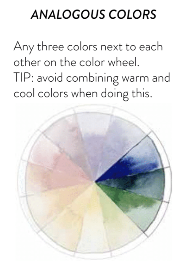
1. Analogous Colors
Fabrics in three neighboring colors on the wheel (like blue, blue-green, and green).
Tip: Stick to either all warm or all cool colors for a cohesive quilt.
See how analogous colors are used in my SNOW GLOBES quilt below.
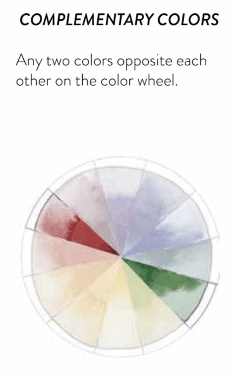
2. Complementary Colors
Fabrics that sit directly across from each other (like red and green or blue and orange).
This creates bold contrast and quilts that pop.
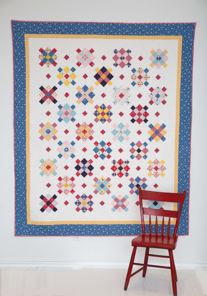
See how blue and brown/orange are used in my WISHING WELL quilt pattern below. Blue and orange are on opposite sides of the color wheel.
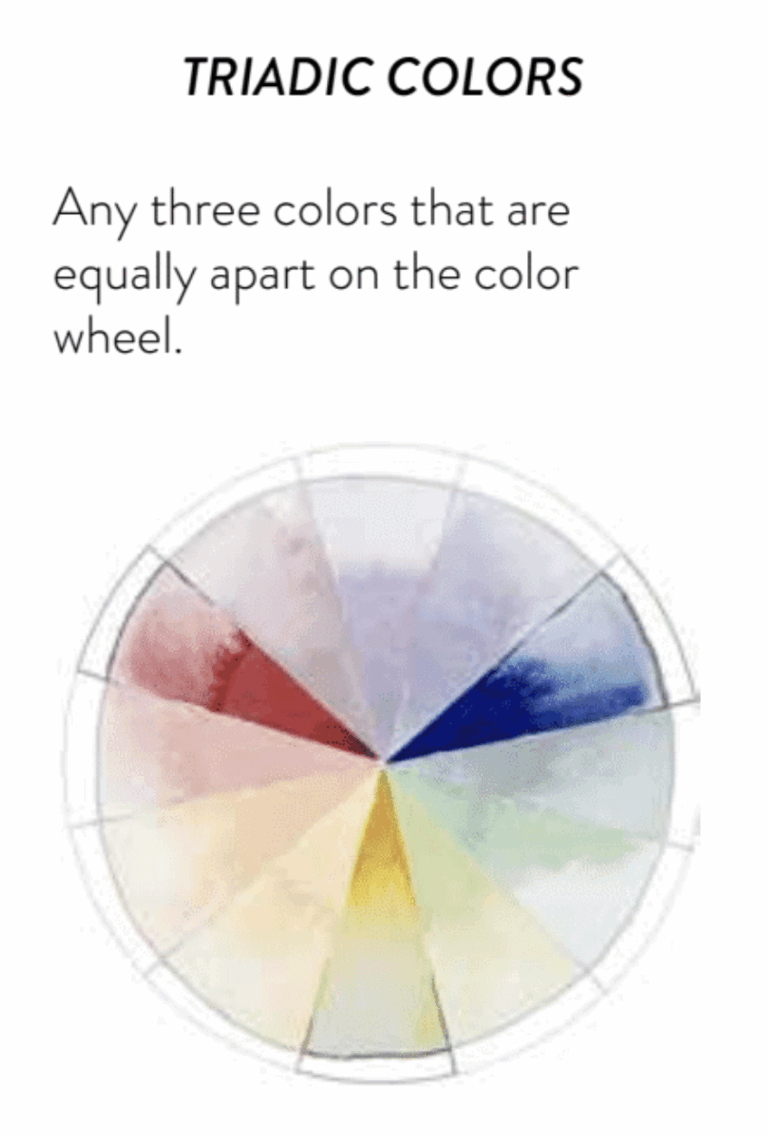
3. Triadic Colors
Three colors evenly spaced on the wheel (like red, yellow, and blue).
Bright, playful, and balanced.
Amy Smart of Diary of a Quilter beautifully applied Triadic Color Theory in her Gretel quilt, shown below.
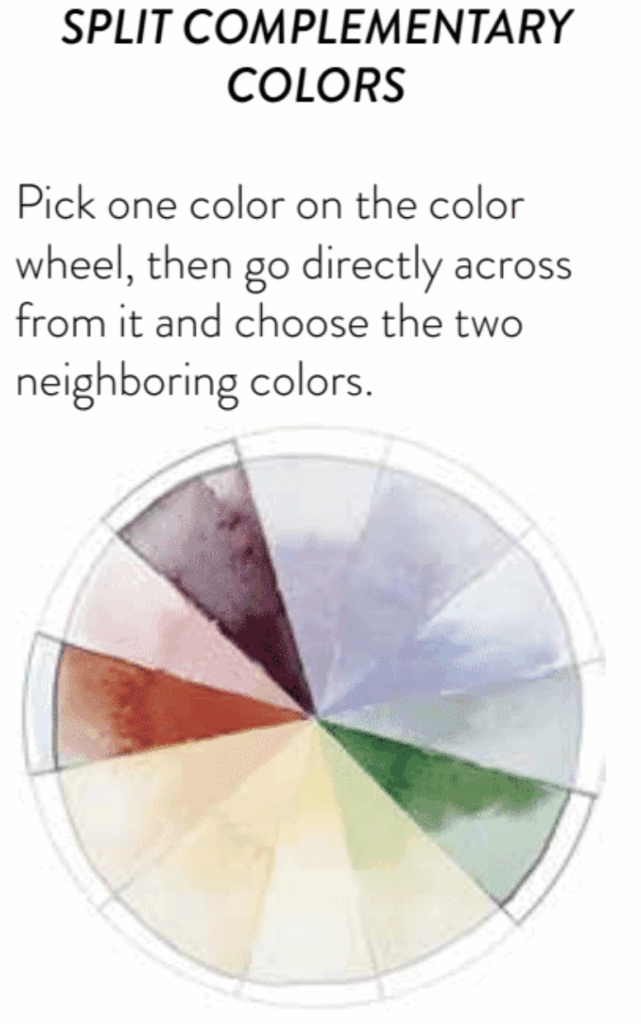
4. Split-Complementary Colors
One main color + the two neighbors of its opposite.
Great if you want contrast without overwhelming intensity.
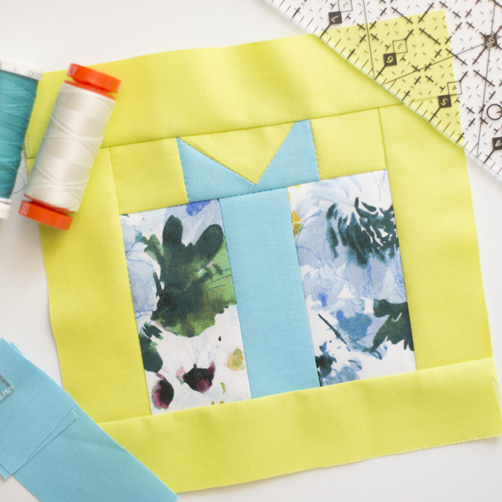
This quilt block was made by my assistant, Natalie Gruentzel. She chose a split complementary color scheme, using blue as the main color and pairing it with green and yellow—the two colors adjacent to blue’s opposite on the color wheel.
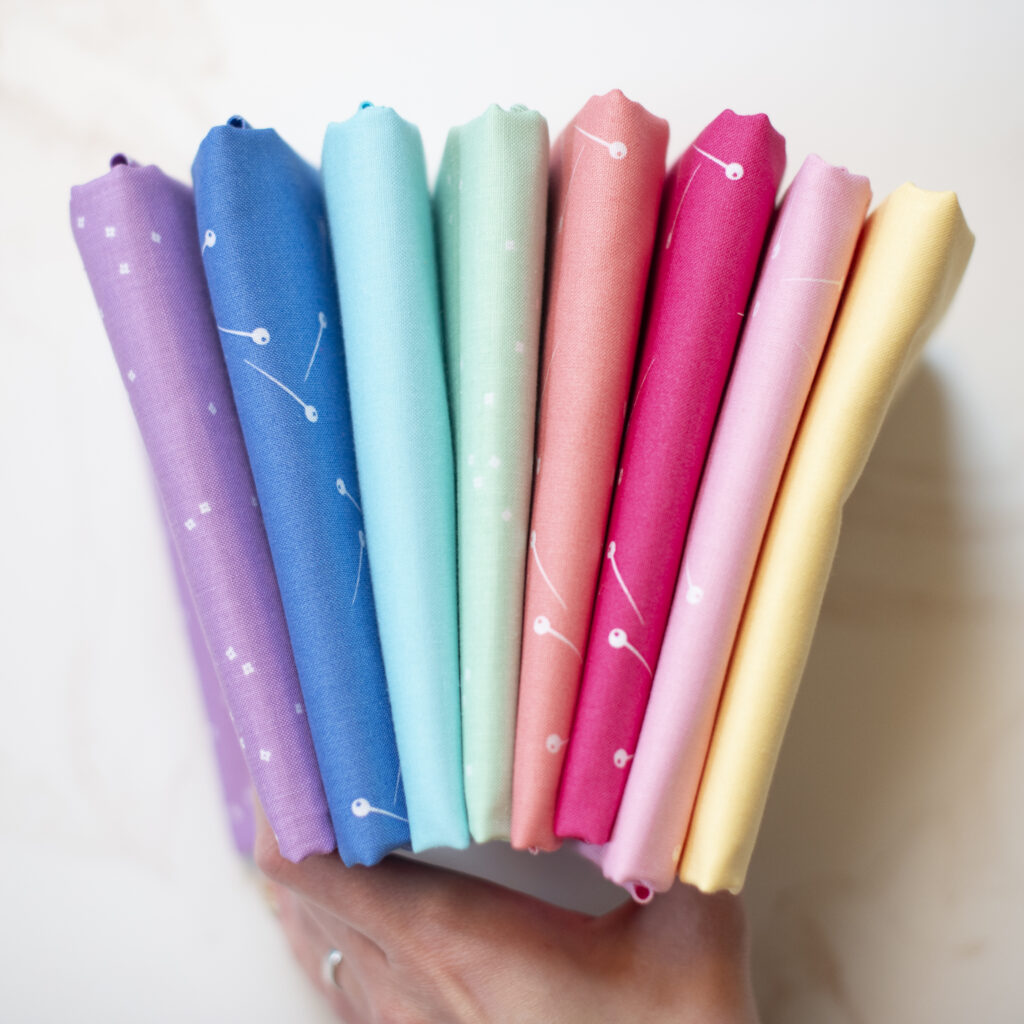
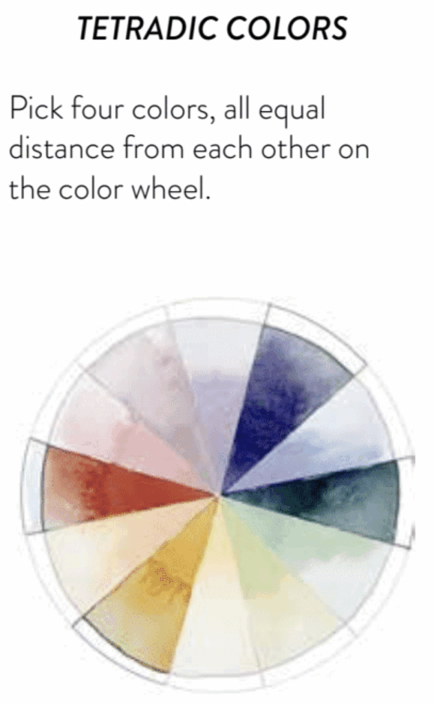
5. Tetradic Colors
Four colors equally spaced on the wheel.
Dynamic, but works best when one color dominates and the others play supporting roles.
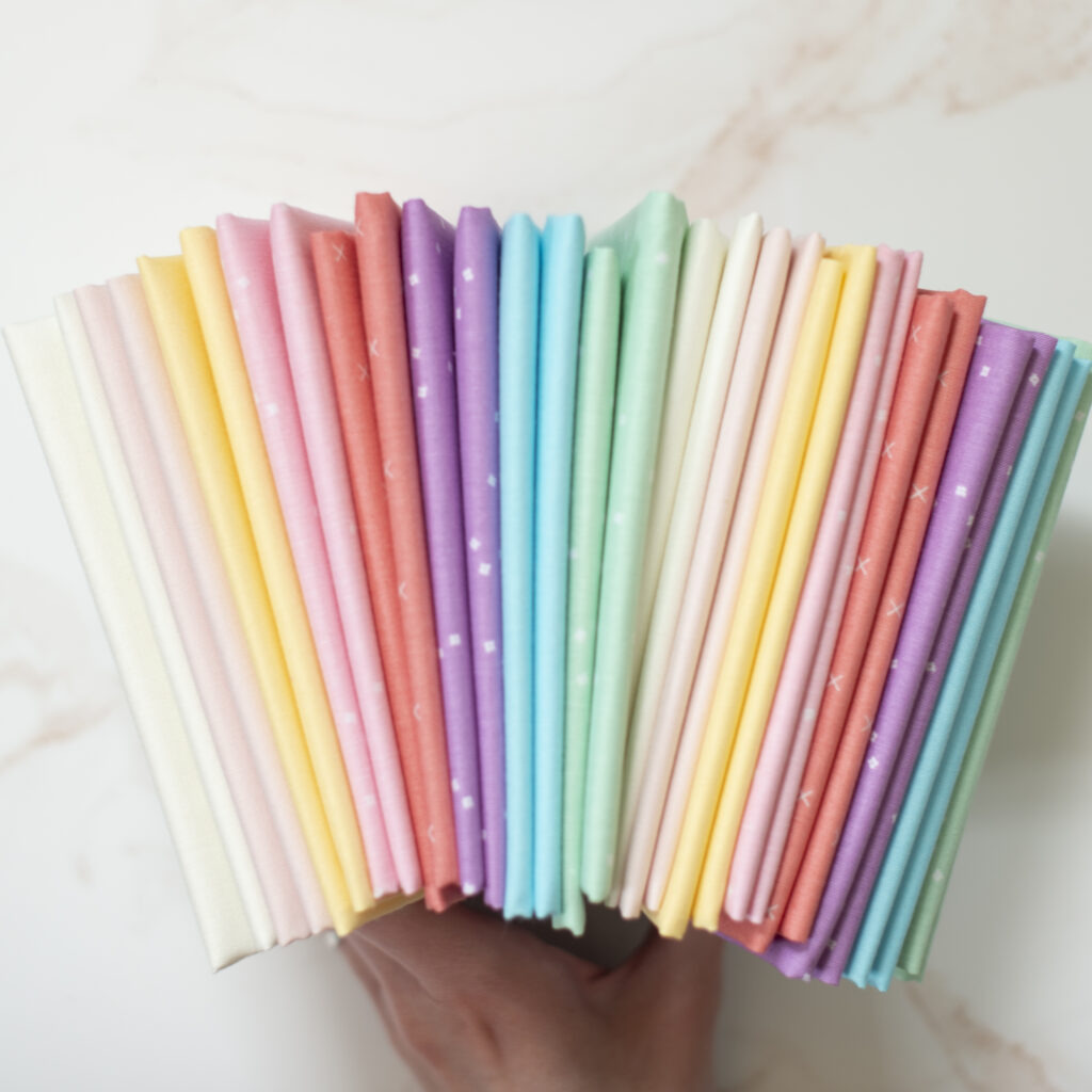
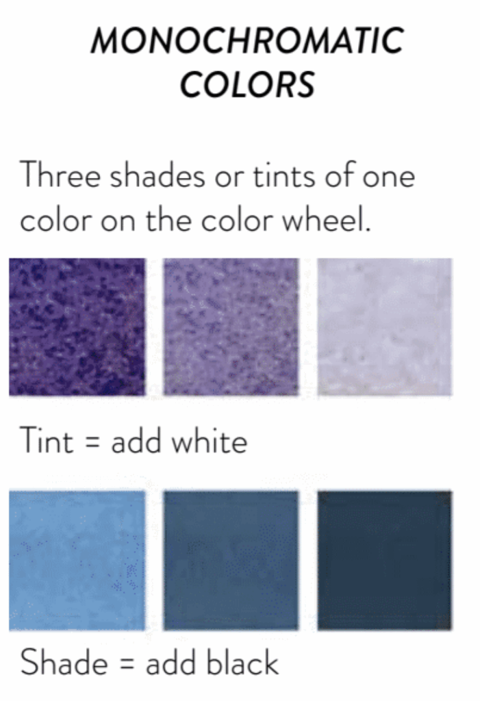
6. Monochromatic Colors
Different shades and tints of the same color.
Elegant, subtle, and perfect for modern or minimalist quilts.
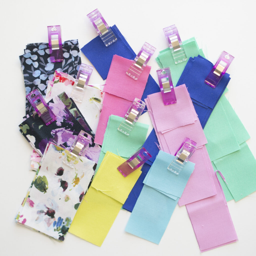
Start with a focus fabric: Pull supporting fabrics from a favorite print.
Balance prints and solids: Solids calm down busy patterns.
Audition before you cut: Lay fabrics side-by-side to see how they interact.
Trust your eye: Color theory gives structure, but your style is what makes a quilt yours.
Conclusion: Choose Fabrics With Confidence
Fabric selection doesn’t have to be stressful. With the color wheel and these simple color theory methods, you’ll know exactly how to put together beautiful fabric combinations. Whether you love bold contrast or soft harmony, you can now approach fabric pulls with confidence—and enjoy the creative process of quilting even more.
MORE POSTS LIKE THIS
If you enjoyed this blog post tutorial, you’re going to love these other popular tips and tutorials: