

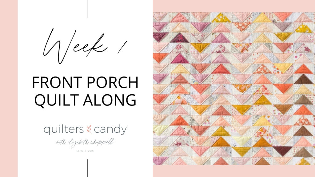
Week One: Picking Your Fabric
Welcome to Week One of the Front Porch Quilt Along! This week is all about choosing your fabrics—the fun first step in bringing your quilt to life. I’ll be sharing:
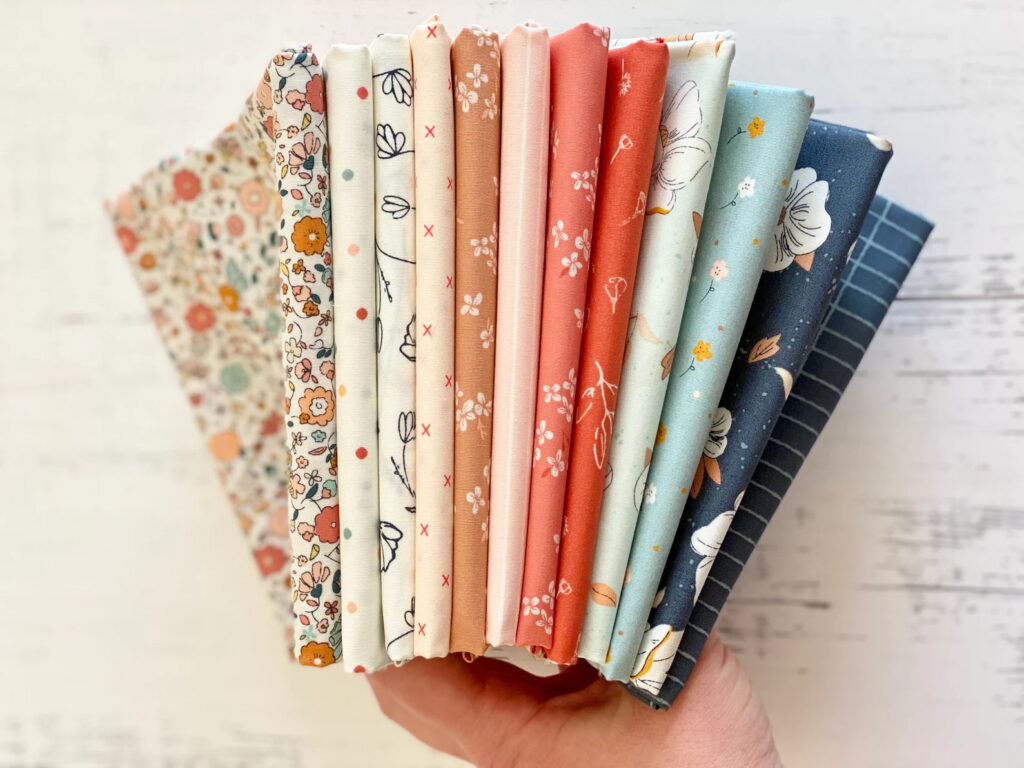
What fabrics I used (including for my very first Front Porch quilt)
Tips for choosing fabrics you’ll love
Ideas for scrappy versions
A peek at my color layout strategy (plus some other colorway ideas)
Plus, there’s a giveaway for those who post their fabric pull this week—keep reading for details!
✂️ Fabric Requirements + Scrappy Option
Make sure you have the Front Porch Quilt Pattern and review the fabric requirements before you start.
Want to make a scrappy version? Inside the pattern, I share exactly how many pieces and what sizes you’ll need.
Please don’t share the cutting sizes publicly—this is copyrighted material.


FREE FABRIC SELECTION GUIDE
I put together a helpful PDF to guide you through picking fabric for your Front Porch Quilt—and I think you’re going to love it!
Choosing fabric can feel a little overwhelming, but this guide makes it simple and fun. You’ll find tips for:
Choosing a color palette that works
Picking low-volume background fabrics
Making your flying geese stand out
Knowing how much fabric to use
Creating balance in your quilt
Whether you’re using fabric from your stash or shopping for something new, this guide will help you feel confident and excited about your choices. Let’s make a quilt that feels beautifully you!
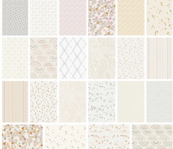
💡 What ARE Low Volume FabricS?
For the background of your quilt, you can use what I used—low volume fabrics. But what exactly does that mean?
I like to think of low volume as fabric that, if you squint your eyes, mostly blends into one light color. These fabrics typically have a pale base with soft, subtle prints.
When I first started, I chose very gentle prints with minimal contrast. But as I went along, I got a little braver—mixing in prints with more personality and pops of color that still felt like low volume overall. It added depth and interest while keeping that calm, airy look.

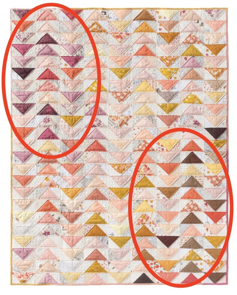
🎨 My Color Layout
When planning my quilt, I wanted the colors to move your eye across the quilt in a balanced way. I placed darker colors in the top left and bottom right corners, with softer tones through the center.
You can use this same method—or go for a random layout, an ombré effect, or whatever suits your style!

📸 Share Your Fabric Pull
Post a photo of your fabric pull and you’ll be entered to win a Fat Quarter bundle of your choice from one of my fabric collections: Gayle Lorain, Road to Round Top, or Bedtime Stories.
HOW TO ENTER:
Use a public Instagram account (required so I can see your post).
Don’t have one? You can create a free, public account just for the quilt along—and only post your fabric pull if you’d like!
Post a photo of your chosen fabrics.
Use the hashtag #FrontPorch25 in your caption so your entry is visible.
TOP POST wins the bundle!
I can’t wait to see what you’ve picked out—let’s kick things off with some gorgeous fabric inspiration!

👀 What’s Next?
Next Monday kicks off Week Two: Cutting Your Fabric!
I’ll be sharing my favorite tips for efficient cutting, organizing your pieces, and getting everything prepped for sewing.
Can’t wait and want to start cutting this week? That’s totally okay! Jump in when you’re ready—this quilt along is meant to fit your schedule.